March 31, 2011

I Spy Suzani

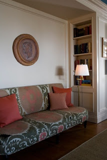
If you look hard enough at every detail in any design magazine, you'll see them. It's kind of like how if you look in every magazine design photo, you'll find fresh flowers. But I'm talking about Suzanis. I know, some of you are saying this is so 2009. But I'm just discovering them and I can't get enough. (That's what happens when you live in the midwest, it takes a while for things to hit.) Suzanis are embroidered textiles from Uzbekistan. They add that rustic appeal that makes a room look real,  and lived in, not like a staged, model home. I love how they can go in a traditional home (see first pic) as well as not so traditional. Its looks handmade and ethnic, not like something you could just pick up at Target. (Although, I did see some Suzani inspired fabric at Hobby Lobby). The genuine article can be used as upholstery, or in pillows, rugs, or wall hangings.  I also spied great suzani-inspired designs on plates, bowls, and boots (okay, maybe that's taking it a bit far, even for me!)

So, have you spied any great suzanis? Next time you are in Uzbekistan, pick one up! Or, check them out here, or on Ebay.
Suzani textiles on table
photo
Couch Upholstered in Suzani Textiles
photo
Suzani Pillow on Bed
photo
Suzani
photo

Suzani Plates
photo

March 26, 2011

Adding Architecture with Fretwork

All design elements look better when placed in an architecturally interesting space. If you've ever noticed catalogs such as Pottery Barn or Crate and Barrel, the rooms that showcase their items are fantastic. There are big old beams,  high ceilings, wall moulding, archways, beautiful windows. But many of us live in houses that lack those things. I came across this idea from an old Oprah show, when Nate Berkus was just a pup (okay, well it was just over a year ago, but before he was a household name). He did this Moroccan kitchen, and I took note of the Moroccan style fretwork he incorporated into the door.

Fretwork Panels in Nate Berkus Kitchen
photo
 I found this company that does amazing work. I'm guessing they did the door for Nate Berkus. Here's some stunning examples of how to bring some interesting architectural elements into your home.

Fretwork Window Screens

Sliding Lattice Fretwork Doors

Red Lattice Fretwork French Doors

Lattice Fretwork Window Screen
Of course I'm partial to the Moroccan style patterns, but with almost 100 different patterns, there's something for everyone!

Moorish Pattern LatticeMoorish Pattern Lattice

March 20, 2011

Zig to the Zag

Call it chevron, call it zig zag, call it herringbone. Call it whatever you want, but it's hot. An instant cool factor for any room. Rugs, pillows, walls. I'm dizzy with excitement!

Chevron Zig Zag painted Bedroom Walls
photo
Chevron Zig Zag Madeline Weinrib Rug
photo: Domino
Painted Chevron Zig Zag Dresser
photo
Chevron Zig Zag Floors
photo

March 15, 2011

Fabric Faves: John Robshaw Blockprint

This is the first of many fabric posts. I love fabric. Not sure why. Maybe because its art that you can touch. And it has a purpose besides just looking at it. You wear it, it blocks the sun, you sit on it, its something to snuggle. Anyway, I kind of have a weird thing about fabric. The tiniest pieces I spy in magazines and have to find out where it came from. Who designed it, what are they like, what's their background. Where is the fabric made, and how. So if you are like me, and I know there's one or two of you out there, this if for you. Here's one of my faves.

John Robshaw- he pretty much sums it up. It's hand printed. It's ethnic. Gorgeous, unusual color combinations. I used his fabric in my baby girl's room. Perhaps a little unconvential for a baby's room, but I love it. Here's some (not so great) pics of the little ladie's room done in John Robshaw fabrics, and some of my other favorite swatches.

John Robshaw Blockprint Crib Bedding


John Robshaw Blockprint Valance and Curtains in Baby Room
photos


photos


March 11, 2011

Color Lover: Teal

Teal is a Hot New Color Trend
It's funny how colors can be so nostalgic to me. I used to think a red and pink color combo was hideous in every way. And now I totally dig it. But we'll come back to that one another day. Today, I've got teal on my mind. It brings back memories of Forenza sweaters, and my sister's bikini circa 1983. A few years ago, I would have probably said it was one of my least favorite colors, but now I'm liking it. But I like it even better when it's called peacock. Probably because it conjures up images of exotic lands rather than The Limited. My latest edition of House Beautiful really sealed the deal, but there are many others. Love it with the red. Fabulous. And the melon tufted sofa with the teal walls... scrumptious.

Teal Painted Bedroom Walls
photo
Peacock Painted Walls
photo
Teal Chevron Sofa
photo
  
Peacock Walls with Melon Tufted Sofa
photo


March 08, 2011

Going Vertical with Library Ladders

Living in tight quarters, I'm always thinking how to make the most of my small space. One of the best ways is to go up. But I'm a short person, so it's not practical to have things I need where I can't reach them. I thought about keeping a nice looking step stool or step ladder around. But why not go all the way with this idea and install a track system library ladder. Of course it would be right at home in a library, but I just don't see myself needing to access the top shelf books on a daily basis, oh and plus, I don't have a "library". To be most useful, it should probably go in the kitchen, better yet a pantry. Yes, a pantry makes more sense, because I might need to access my bread maker on a daily basis. Beautiful organization, functioning perfectly.

Cream Kitchen with Ladder Track System
photo
photo
White Kitchen with Library Ladder
photo
Using Verticle Space with Library Ladder in Kitchen
photo

March 03, 2011

Stairway to Heaven

I have a thing for Moorish patterns. I first saw them in southern Spain, the best example being at La Alhambra in Granada. But really the gorgeous tiles were everywhere, on the outsides of buildings, in crummy public bathrooms, outside walkways.  Their intersting patterns have become somewhat of a passion of mine, I seek them out in any form I can find. And this is an amazing find. Stair stencils in Moorish patterns. It's like you are walking to heaven. This sums up my love of design. It's useful (they are stairs, they take you somewhere), pattern, ethic feel, and color (okay, just the yellow one). The brilliant creator behind these stencils is Melanie Royal, and she rocks.  She takes students on her trips to help with the stenciling. What a dream to learn by her side.I would love to go on one of her trips. Italy, Morocco, I think she's doing Spain next. I could feature a million things from her blog, so expect to see more!

Moorish Pattern Stencil Painted Stairs

Moorish Pattern Stencil Painted Stairs

Moorish Pattern Stencil Painted Stairs

photos