August 26, 2012

Chevron Style at the Biltmore Arizona

Last minute I decided to tag along with my husband for a business trip to Phoenix. I have never been to Phoenix, but I did a quick look at the hotel and thought it would be a perfect mini vacay. I noticed palm trees and meandering walkways and was sold. It was a resort, and that's just what I needed. What I didn't expect was the amazing architecture and details. As fate would have it, I was staying at the Arizona Biltmore that was designed by Albert Chase McArthur, who had studied under Frank Lloyd Wright. So the whole place has a Frank Lloyd Wright feel to it. I had forgotten how much I loved his style. And coincidental to be there while this style seems so hot right now. I know Frank Lloyd Wright's style is timeless, but there were so many references to styles I'm seeing right now. 

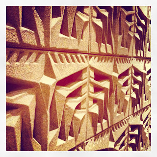
Upon entrance, you see this: 


Which Reminds me of all the single chevron jewelry that I'm loving these days:

photo
photo
photo
photo
Wandering through the place, I found the single chevron everywhere. On a napkin holder: 

On tables: 


And a tribal version on the hundreds of thousands of blocks found throughout the sprawling resort:

The motifs found throughout the Biltmore had a tribal feel to it much like the patterns I'm loving these days:
photo
photo
As I've said before, I'm seeing chevron evolve-- this time I found it to be simplified, and some of what I see here is almost the triangle version that has a tribal feel to it. 

Anyway-- great trip, and loved being pleasantly surprised at the beauty I was surrounded by. On a side note, I feel it's my duty to not give misconceptions in blogland. Just so you know, I do not regularly get to jaunt away for side trips to a resort and spa. I tagged along with my husband because it was free (we used miles for my ticket), and there was some major juggling to have my kids in good hands for 2 1/2 days, which left my mom dealing with a middle of the night episode of one child constipated and the other saying he was going to throw up. Luckily, the poop came out, but no vomit. I'm incredibly grateful to have friends that pitched in, and my mom who spearheaded the childcare while we were gone. 

August 22, 2012

Eco Throws for Winter 2012 are coming soon!

happy habitat modern graphic blankets
happy habitat modern patterned cotton eco blankets
happy habitat modern cotton eco blankets
happy habitat modern geometric pattern eco blankets
happy habitat modern pattern cotton eco blanket
Teal,
Happy Habitat Greek Key Throw Pillows
happy habitat modern geometric blankets
happy habitat modern cotton eco blankets


I'm so excited to debut my new collection of Eco Throws. ALMOST ready to add to the site. Here's a sneak peak of the Look Book I put together.

What do you think?

August 14, 2012

Experience Life Magazine Feature!

Happy Habitat Eco Throws made an appearance in the August issue of Experience Life magazine! Great magazine by the way-- all kinds of practical, healthy advice!


August 11, 2012

I Spy: Triangle Art

As much as I hate to admit it, sometimes art is trendy. As is fashion. I can tell myself-- it's a basic black (fill in the blank here-- blazer, pant, dress), but the facts are that cuts change, and your basic black pant or whatever doesn't look as great 5 years later, usually. Low rise, high rise, pleats, shoulder pads, zippers, etc. all those little details make the difference. But I digress (as I do often)-- we're talking about art. Am I seeing a trend with all this lovely faceted triangle art? I know art stands the test of time for sure, but what about trends in art? Will those go down as the 'faceted triangle' age, and be a classic? Either way-- I LOVE it no matter what.

photo
photo
          
photos

photos

Lamps:

photo
Even seeing it in furniture:

photo
Love this faceted Desk.
Have you seen this whole house by Kelly Wearstler? EVERY SINGLE SURFACE is inSANE. Expensive, exotic materials. Who has BRASS kitchen cabinets? Crazy.
(and a side note: the blog above that links to these pics-- My Favorite and My Best is so freaking hilarious. )


photo
Oh-- and found this cute pillow at Target:

August 02, 2012

painted trim for the boys room

It's about time to switch things up for Reece's room. He'll turn 8 this year, and his room has stayed the same since he was a baby. It's not that it's babyish, but time for a change. He has full length curtains that will come down. I've been trying to figure out how to make the 3 windows in his room interesting, without being frilly and girly. Thought maybe I'd paint the window trim in a contrasting color. I'm thinking of navy walls with turquoise trim. I can't decide if the baseboards and crown molding should be painted turquoise too, or just the windows, or maybe just the back of his door, or his closet. I'm obviously undecided.

photo
photo
photo
photo
photo
photo

So after looking these over, I think anything goes. It doesn't matter if you do both the crown moulding and baseboards, or just the windows, or one or the other. High contrast or low-- anything works. Like I said, I'm thinking navy walls (or that funky greenish/teal navy, like the main color below) with turquoise trim. I'm certain that will change since I've already changed my mind 3 times. I'm so lucky that the kiddo doesn't care. I've asked him 3 options so far and he said yes to all. First one was grey and white painted stripes with turquoise trim, second was turquoise and white stripes on just one wall with navy trim, and now we've landed at navy walls with turquoise trim. We'll see what actually happens. Kind of depends on if I can score this rug:

More on that later. And no, I'm not sick of chevron yet!