September 29, 2011
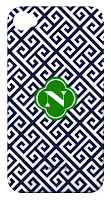
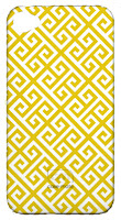
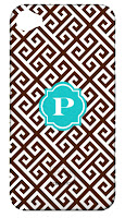
 New in the Shop: Greek Key Phone Cases
You already know I love Greek Key Pattern--- so I don't know why I waited so long to make a Greek Key Phone Case, but it's here! Customized it by choosing the pattern color and initial color and shape. Check it...
September 27, 2011
 Is Turkey the new Morocco?
If you've read Happy Habitat before, then you'll know my madness for all things Moroccan, most notably Moroccan Patterns. I think it's a trend that has stuck, and will still stay around in the realm of global design. I'm seeing something new on the horizon: Turkish Design and Patterns. It's a little less in-your-face in terms of ethnic design. Some of it to me almost looks a bit Scandinavian or Dutch (maybe that's just the tulip motif). It has a homey- folky feel to me. I don't know that it will replace the Moroccan trend, but I think we'll see more of it.
The traditional Turkish ceramics, called Iznik, typically stay within the color palette of turquoise, cobalt blue, green and red. Turquoise being the predominant color. The color Turquoise is named from the Turquoise stone that was founded in Turkey. Here are some old school examples:
The traditional Turkish ceramics, called Iznik, typically stay within the color palette of turquoise, cobalt blue, green and red. Turquoise being the predominant color. The color Turquoise is named from the Turquoise stone that was founded in Turkey. Here are some old school examples:
 |
| photo |
 |
| photo |
 |
| photo |
And some new school examples:
 |
| I love Ann Sacks' modern take on Turkish Tiles. |
 |
| photo Another fresh take on Iznik Tiles |
 |
| Totally digging this line from Turkey: Tulu Textiles |
 |
| And I'm completely flipping over this cool patch-work upholstery from Bokja (must check out their cool website). The designers are based in Beirut, but originally from Turkey. Looks like the textiles have their origins in Uzbekistan region as well. |
And last but not least: the inspiration that I saw when flipping through my latest Elle Decor that got me thinking, "I'm seeing a lot of Turkish Patterns I'm liking":
 |
| photo |
Here's more from London's Handmade Interiors:
 |
 |
| photos Patterns inspired by Turkish Tile |
September 22, 2011
 Color Lover: KELLY GREEN
There are certain colors that in general, I've never really liked. Purple being one, not plum or periwinkle, but bright K-State Purple. I just can't envision how that could look good in a room (let alone on cabinets, that's going to be a tough one!) But we'll cover purple another day. Today I'm thinking Kelly Green, like the color of a Green Crayola Crayon. I'm not sure what the difference between Grass Green and Kelly Green is, but Kelly Green seems to have a preppy connotation to me. I never been drawn toward adding Kelly Green to my home, but I'm now having a change of heart. I love how I can expect the ugliest of colors, or color combinations to somehow be seen in a beautiful light when done right. I think I'm seeing Kelly Green most often with brown and white or black and white. And it works. Preppy isn't quite my aesthetic, but I don't think I'd call any of these Kelly Green spaces preppy. Just cool.
 |
| photo |
September 19, 2011
 DIY Lighting
I need to start doing some more DOING and less thinking about what I need to do. I've got a million and one ideas spinning around in my head. Should I stencil my walls? Should I stencil my floors? Should I make a pelmet for my office? Yes, all these are all on the to-do list. Also on the to-do list: a DIY light. I've needed a new light fixture for my office and one for the dining room for quite a while now, but I'm not really sure exactly what I want, and the ones that I have found are pricey. I came across some pretty amazing DIY light pendants. Check out these string/hemp/yarn/jute globe pendants. I'm not sure that these are exactly what I'm thinking, but I like them. I'm worried that it will cast a weird light in my office where I really need to be able to see well.
I've also been thinking that I should try to do something with perforated sheet metal. It comes in all kinds of cool patterns. I'm thinking it would start something like this:
And add a liner and a diffuser. Has anyone attempted to make something like this? I think perforated sheet metal is the same stuff that you use to make radiator covers. Any other great DIY light options I may have missed?
 |
| photo |
 |
| photo |
I fell in love with this beachy Malibu Chandelier from Serena and Lily, but it might be too small for either space, not to mention the $900 price tag. OUCH!
Although this one does look like a really easy DIY.
I love the tassel detail.
Although this one does look like a really easy DIY.
I love the tassel detail.
 |
| photo |
I'm sure you've seen the turquoise similar version. And I've seen some not-so-great- DIYs of it.
But I have to say, this one is very impressive:
 |
| photo |
 |
| photo |
September 17, 2011
 Happy Habitat Eco Throws: Recycled Cotton Blankets
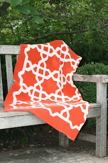
I couldn't be more excited about my new Eco Throws. Soft, thick recycled cotton blankets perfectly sized for throwing over a chair or couch or for taking an afternoon snooze. Not too thin, not too heavy-- just right at 3.5 pounds. Graphic patterns are bold and add instant style. Or turn it over for a neutral look.
Recycled cotton does not mean it's made from old t-shirts from a thrift store (ewwww!) but instead from pre-consumer clippings. So those extra pieces get a new life instead of going to a landfill.
100% vegetarian. No animal used in these throws.
The Eco Throws come in 4 pattern and 4 colors: there's the Fretwork Throw which is inspired by Moroccan tiles, and Tribal Throw which is a simplified version of an ancient Arabic pattern, there's the Zigzag or Chevron Throw-- which is bold and graphic, and last is the Lattice Throw which is a square chain pattern.
The colors are Paprika, which is an orange that's a tad bit on the red side, Ochre is... well, Ochre- a deep saturated goldish yellow. The pictures don't do the Ochre justice, it's really a fantastic color and looks great with grey. Cerulean is a typical turquoise-- not too bright, no too light, not too dull. And Mushroom is a classic taupe. All patterns are paired with ivory... a slightly off-white.
 |
| Fretwork Eco Throw Blanket in Paprika |
 |
| Tribal Eco Throw Blanket in Ochre |
 |
| Zigzag Eco Throw Blanket in Cerulean |
 |
| Lattice Eco Throw Blanket in Mushroom |
Visit the SHOP to find out more.
September 13, 2011
 More Moroccan Tiles
Funny how when I have something on my mind, it seems to pop up again and again. Kind of like how you hear someone's name that you haven't seen in a while, then you run into them. Anyway-- I just posted on Moroccan Tiles, and then I came across these beauties in House Beautiful. Stunning.
photos
And some beautiful installations from Tabarka Studio:

|
September 11, 2011
 Rainbow Cabinets: PINK
I've got kitchen cabinets on my mind. Probably because I really need to clean mine, and they are starting to fall apart. So, I've been dreaming of what kind of kitchen cabinets I would have if I could have new ones. I like to think in terms of 10 years down the line, am I still going to like it? Cabinets should be classic since most likely you are going to keep them for a while. And sometimes classic to me is the unexpected. A random color that isn't a trend, but just something that you really like.
With that thought, I'm starting a new series: Rainbow Cabinets where I am challenging myself to come up with kitchen cabinets in every color of the rainbow, that I actually like. Maybe I wouldn't put it in my own house, but I can honestly say-- "that looks pretty cool". So today, we start with PINK. I figured this would be impossible, but I can truly say these kitchens are lovely!
With that thought, I'm starting a new series: Rainbow Cabinets where I am challenging myself to come up with kitchen cabinets in every color of the rainbow, that I actually like. Maybe I wouldn't put it in my own house, but I can honestly say-- "that looks pretty cool". So today, we start with PINK. I figured this would be impossible, but I can truly say these kitchens are lovely!
 |
| photo |
 |
| photo |
September 09, 2011
 Were you born in a barn?
 |
| photo I'm proud to say this beautiful home is from my neck of the woods. I love how seamlessly the barn doors flow here. The door almost looks like a piece of furniture, and the track system blends in with the wood ceiling beams.
This is my good friend, Jackie's nursery.
She installed a barn door to separate her bedroom from her little boy's room.
She built this herself for less than $300. So charming.
|
 |
| photo |
 |
| photo |
 |
| photo |
 |
| photo |
Subscribe to:
Comments (Atom)


